AI-Generated Economic Scenarios
We provide thousands of real-world economic scenarios that capture diverse market conditions and economic environments.
- Reliable economic scenarios with historically consistent stylized facts.
- Coherent macroeconomic indicators provide a multi-angle perspective on the economy.
- Full spectrum of economic scenarios, ranging from deep recession to booming economy.
- Flexible economic scenario generation with customizable time horizons and start dates to match your needs.
- Powered by our thoroughly vetted AI-based economic scenario generator.
Economic Variables
Our AI-generated economic scenarios include the following macro variables:
- Inflation rate (CPI)
- Unemployment rate
- Treasury 3-month rate
- Treasury 5-year rate
- Treasury 10-year rate
- 30-year fixed mortgage rate
- Real disposable income growth
- Real GDP growth
- S&P 500 stock market index
- Market volatility – VIX index
- House price index (HPI)
- Oil price – WTI
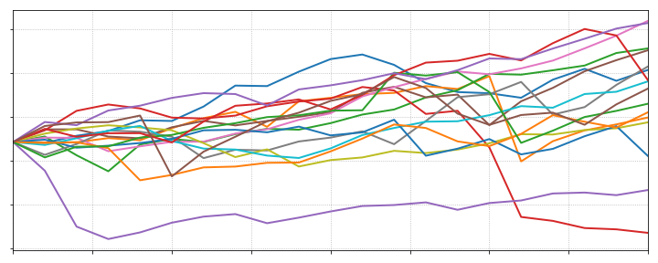
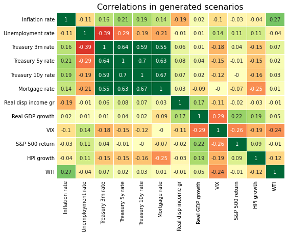
Analysis of Economic Scenarios
- We illustrate distributions and correlations of the generated economic variables in our latest blog post.
- We demonstrate several specific examples of generated macroeconomic scenarios and discuss the observed stylized facts.
Interested in Learning More?
Contact us with any questions about our economic scenarios. You can also request a free sample of generated scenarios.