Economic indicators play a vital role in measuring the health of an economy. Some important macroeconomic indicators are the unemployment rate, consumer price index (or CPI which measures inflation), gross domestic product or GDP, disposable income, short-term and long-term interest rates (such as Fed Funds rate and Treasury rates), house price index, and stock market performance metrics.
The relationship between the indicators can be complex and dynamic due to changing monetary policy, geopolitical situation, population growth, etc. Let’s look at the long-run interrelation between macroeconomic indicators for the US.
Historical Data for Macroeconomic Indicators
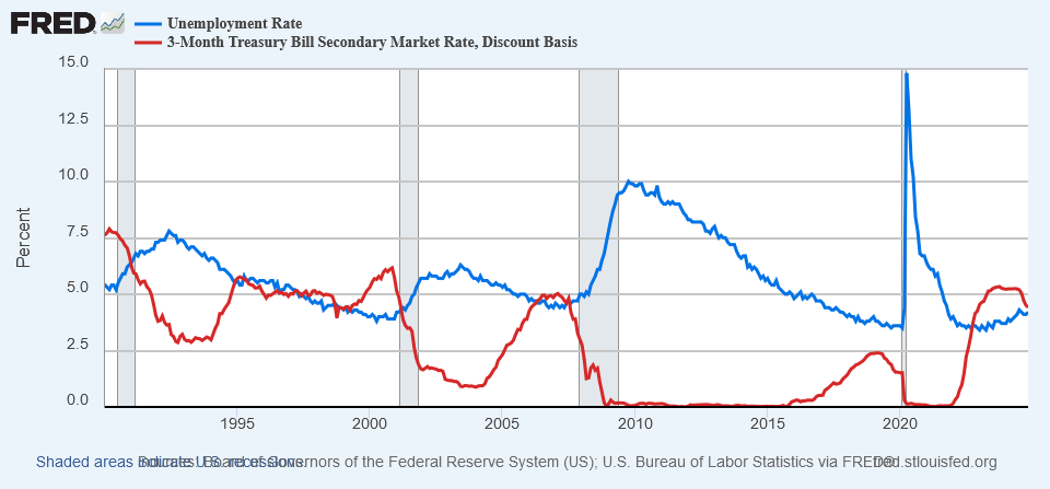
Our analysis is based on historical data covering 1990 to 2023. During that period the US economy experienced many ups and downs including four recessions: the Gulf War recession in 1990-1991, the dot-com bubble in 2001, the Great Recession in 2007-2009, and the pandemic in 2020. Besides, the economy underwent a near-zero interest rate environment in 2009-2016 and 2020-2022, and had a record-low unemployment rates in 2018-2019 and 2022-2023.

The unemployment rate and Treasury 3-month rate often move in opposite directions as one can observe from the chart above. We can quantify the strength of their relationship with the correlation coefficient. In the following sections we will look into the correlation for these and other economic indicators.
Correlation Between the Economic Indicators
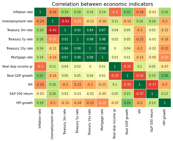
We calculated the pairwise correlation between eleven macroeconomic indicators and visualize it with a heatmap.

As a quick reminder, for a pair of variables a correlation close to 1 implies a strong comovement in the same direction. Conversely, a correlation close to -1 is an indication of a strong comovement in the opposite direction. Finally, a correlation close to zero indicates a weak or absence of any (linear) relationship between two variables.
From the heatmap above, we can immediately observe that all interest rates have a strong positive correlation. This is expected as they often move in tandem when reacting to changes in monetary policy.
Another observation is that the Treasury 3-month rate positively correlates with the inflation rate. This is because the Treasury 3-month rate closely tracks the Fed Funds rate which the Federal Reserve Board (FRBor the Fed) uses to control inflation. When inflation increases, the FRB hikes the Fed Funds rate to make borrowing more expensive. As a result, it reduces the money supply for businesses and consumers, decreasing their purchasing power and helping to lower the inflation rate. Typically, the Fed adjusts the rate with a delay, as it prefers to see that the inflationary trend is sustained before making any changes to interest rates.
We can also notice a negative correlation between the S&P 500 (SPX) return and VIX (stock market volatility). One may expect a stronger correlation between these two indicators since VIX spikes when the stock market sharply drops. The reason for the weaker correlation is the granularity of the data. We could observe a much stronger negative correlation between SPX and VIX on daily or weekly data. However, with monthly or quarterly data, the market’s partial recovery during the period makes the relationship with the VIX less dramatic.
Limitations of the Correlation Analysis
In the heatmap above, the correlation between real GDP growth and real disposable income growth is negative which is counterintuitive. When the real disposable income growth is high, consumers have more money to spend on discretionary goods and services, which should positively impact GDP.
The reason for the negative correlation is rather technical. In the above heatmap, we used the most popular Pearson correlation method. However, the Pearson correlation is very sensitive to large outliers. This means that a rare large movement in the historical data may distort the correlation between the two indicators.
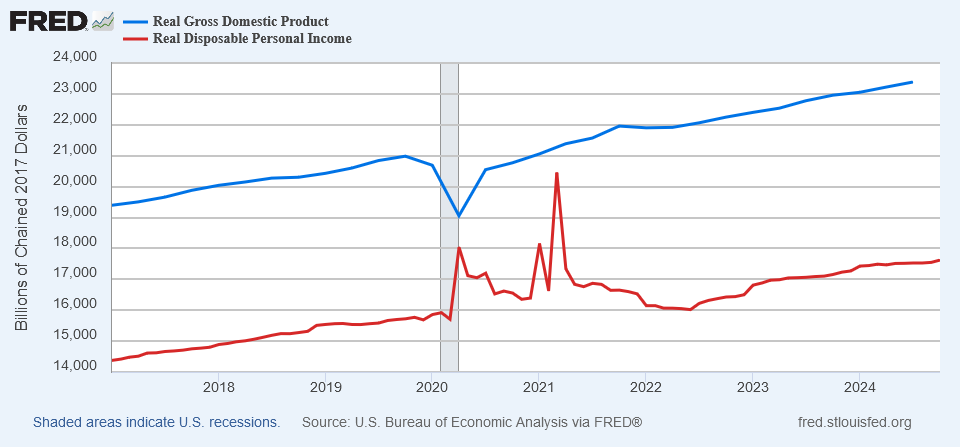
We can see from the chart below that shortly after the pandemic lockdown real GDP went sharply down. On the contrary, real disposable income jumped due to the government stimulus. The magnitude of these movements was so strong that it distorted the (Pearson) correlation between GDP and disposable income.

Another limitation of the Pearson correlation is that it requires linear relationship between economic variables.
Rank-Based Correlation Between the Economic Indicators
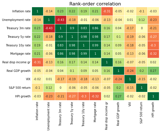
To eliminate the impact of the outliers, we utilized the Spearman correlation method also known as rank-order correlation. We can observe that in the new heatmap, the Spearman correlation between real GDP growth and real disposable income growth is now positive which makes more sense.

Besides, the rank-based correlation between the inflation rate and real GDP growth is nearly zero. It is more reasonable since, under a strong economy, increased demand for goods and services can outpace the supply, leading to high inflation. On the other hand, high inflation can erode the purchasing power of consumers, which can slow economic growth.
The correlation sign between the inflation rate and HPI growth also changed in the rank-order heatmap. Unlike real GDP, the relationship between the inflation rate and HPI is much more complex and depends on other factors. For example, while increased material and labor costs during high inflation may increase property prices, higher interest rates may reduce the affordability for mortgage borrowers. Besides, supply and demand, population growth, and overall economic health are important factors impacting HPI too.
Finally, unlike Pearson correlation, the Spearman correlation does not require linear relationship between variables. Specifically, the Spearman correlation captures monotonic relationship even if the relationship is not linear.
Conclusion
Macroeconomic indicators are highly interrelated; even from this simple correlation analysis, it is evident that their relationship is quite complex. For example, the relationship between two variables may be impacted by a third variable. Long-term relationships can also be disrupted by a sudden shock or a short-term reversal. Besides, some indicators may lag others which introduces another layer of complexity in the relationship of economic indicators.
At Scenarios by AI, we developed generative AI models that capture the complex dynamics of macroeconomic indicators. These proprietary models generate a wide range of coherent macroeconomic scenarios. Reach out to explore how these economic scenarios can help you enhance your quantitative risk management.
